Bumble Rebrand
Love Reimagined: A Rebrand for the Next Generation of Dating
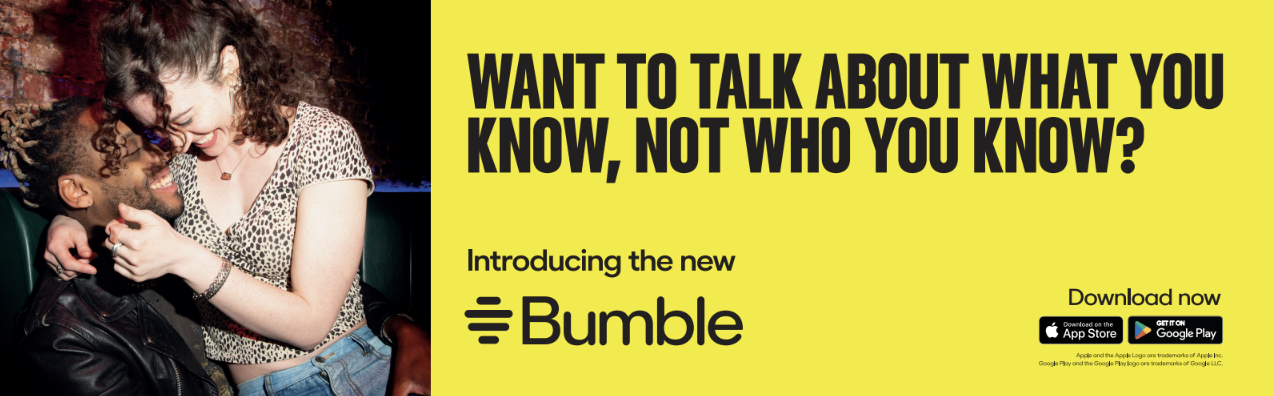
For a decade, Bumble has been at the forefront of empowering women in the dating scene, but as the dating app turns 10 years old, many daters are fatigued by the apps; 70% of women reporting experiencing dating app burnout. Equally, three in four women say the look and feel of a dating app is crucial to their overall experience.
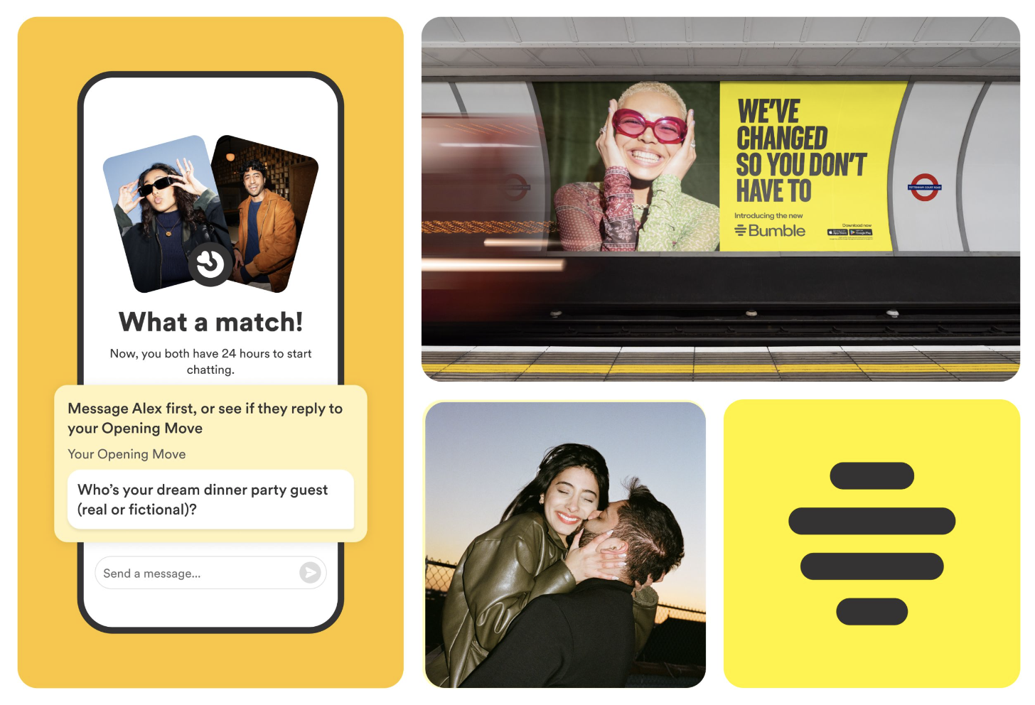
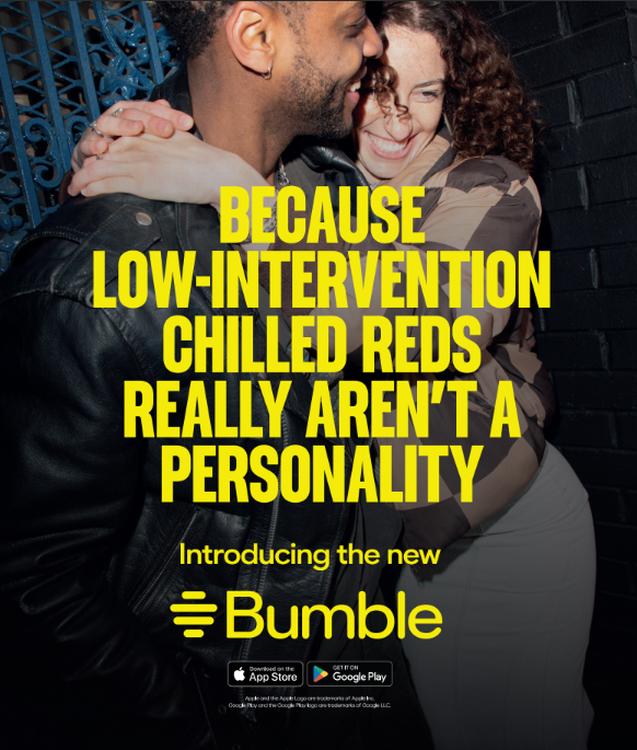
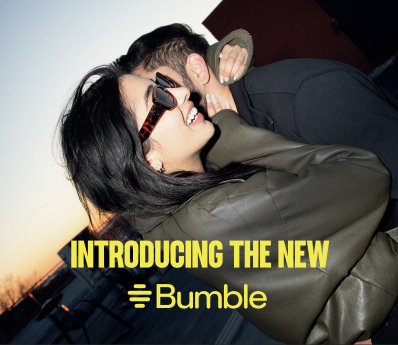
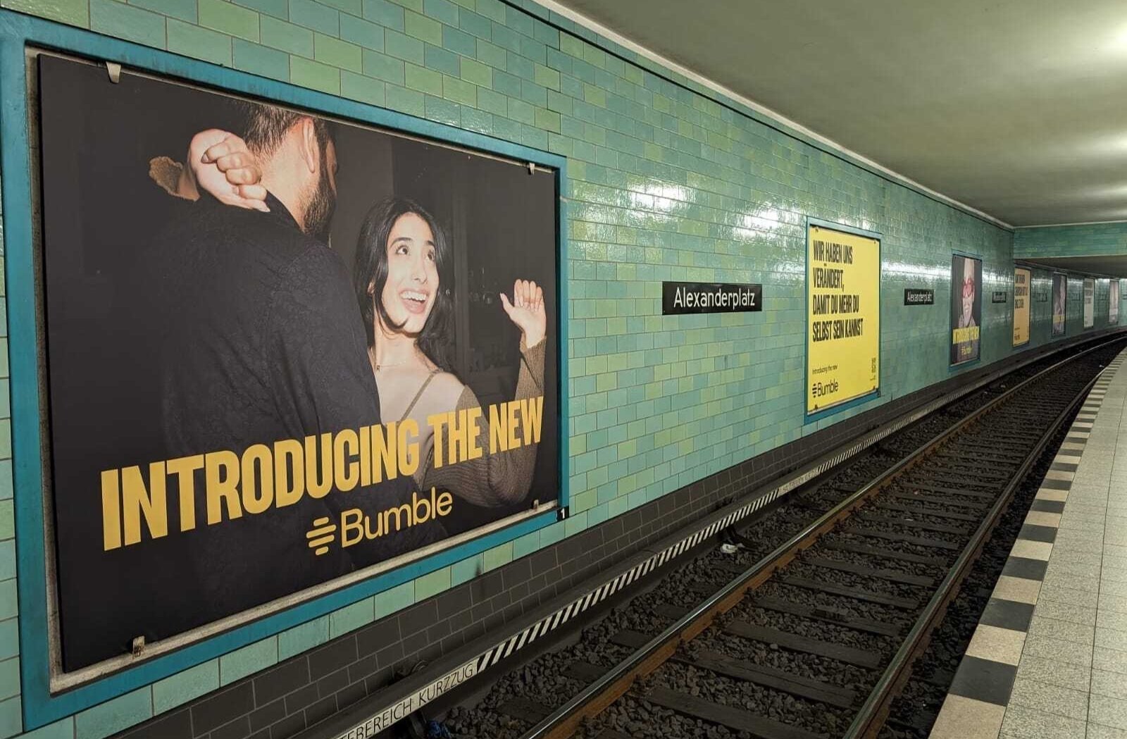
So, it was time for a refresh and Bumble therefore launched a complete make-over of its brand strategy, narrative, ethos which evolved into a 360 degree glow-up of both the brand look and feel and app experience.
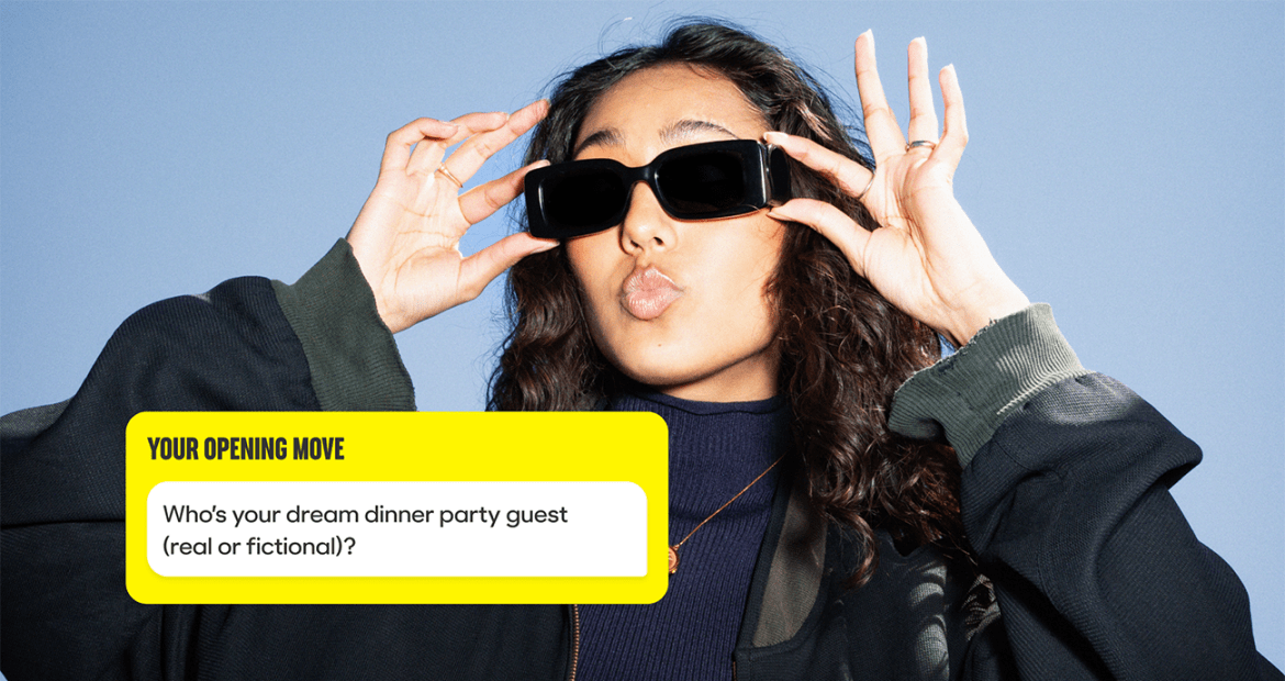
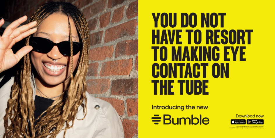
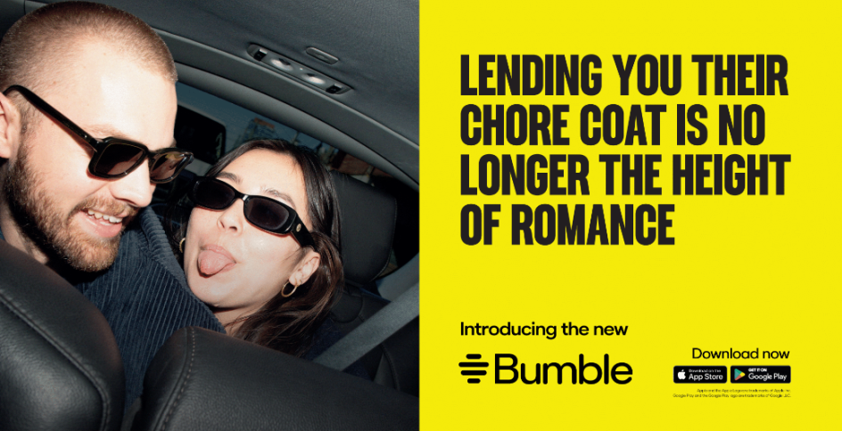
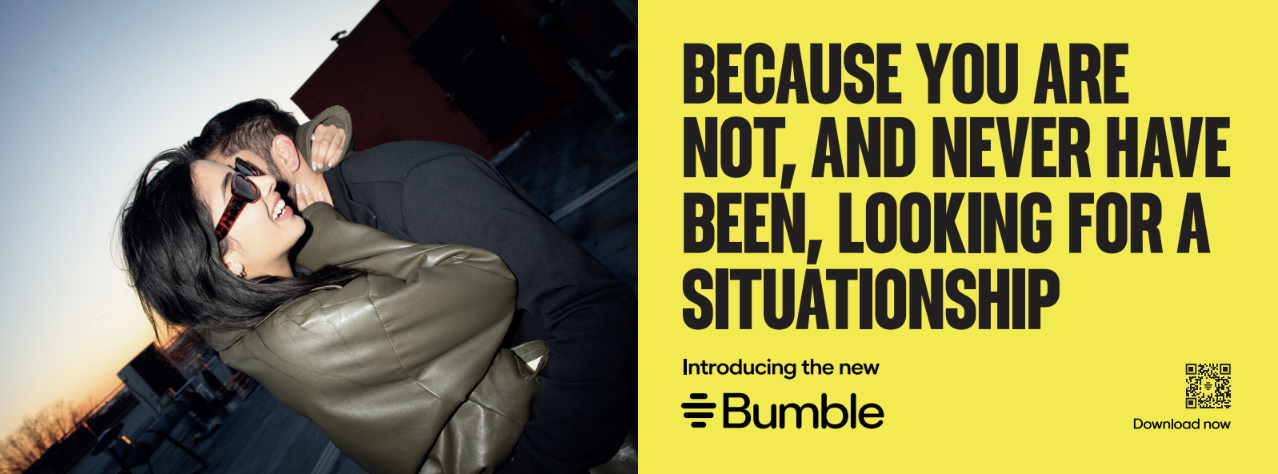
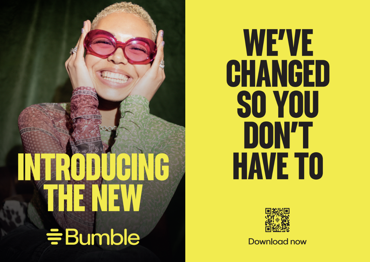
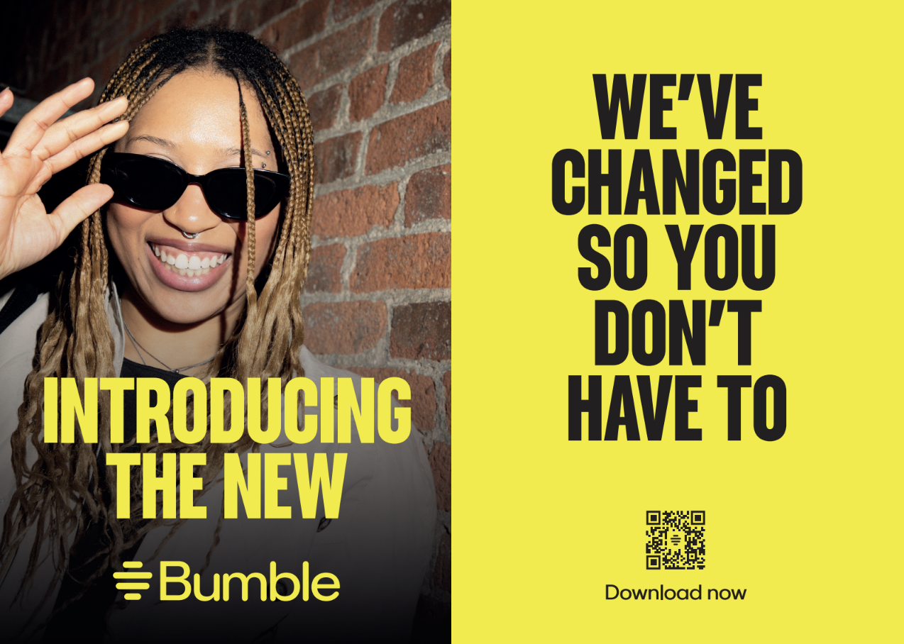
A fresh aesthetic that provides a sleek, modern, and user-friendly dating and brand experience putting women first across the entire dating journey.
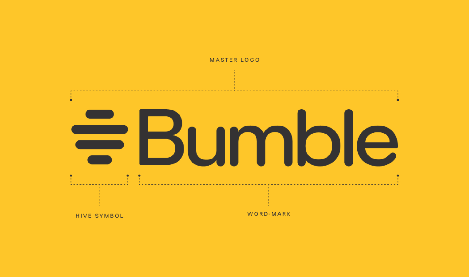
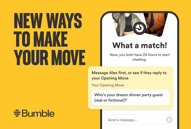
Beyond the brand strategy and upgraded narrative the rebrand included a new strong logo and beehive icon, a fresh new colour palette, bolder typography, modernised style of photography and distinctive illustrations, to once again make the iconic brand reflect the vibrant and legendary Bumble spirit.
With the rebrand, Bumble is doubling down on its commitment to putting women first. So, whether people are swiping for love, friendship, or anything in between, Bumble has got you covered.


"Female-first dating app Bumble unveils bold new look" - Creative Boom
"Female-first dating app Bumble unveils bold new look" - Creative Boom
"Bumble relaunches app" - FORTUNE
"Bumble relaunches app" - FORTUNE
"Bumble unveils redesign" - Fast company
"Bumble unveils redesign" - Fast company